 |
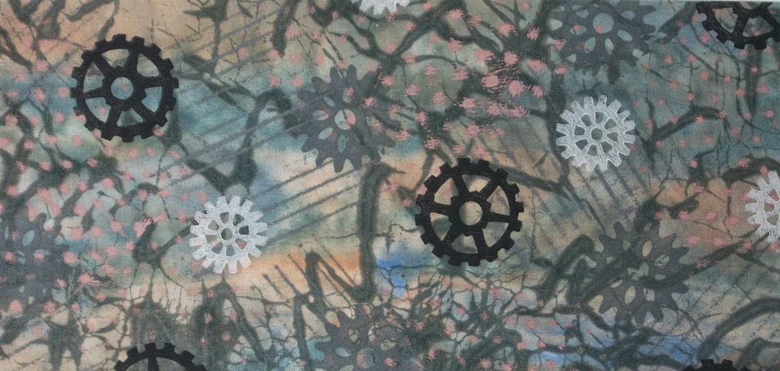
| Susan's final "industrial" fabric. |
I finally finished my contribution to The Printed Fabric Bee's Industrial Collection. It was due to Queen Bee, Susan Purney Mark, three weeks ago. But, as sometimes happens, life and vacation intervened.
 |
| Detail |
From the beginning, this was a bit of a challenge for me. First, it was the color scheme...neutrals. I have to admit, I'm sort of a color junky. I often admire artists that have the ability to work with neutrals. So very subtle...where one tends to pay more attention to marks and texture. Often subdued color artworks can appear to be more sophisticated. Then there was the theme...industrial. I admit that I don't get that inspired by all things industrial. Fortunately, Susan had a very loose interpretation of the theme. She was more interested in old industrial...rust, peeling paint, etc.
I decided to start off by monoprinting a piece of white cotton. I painted layers of transparent fabric paint on plastic film and then laid the fabric on top to pick up the paint.
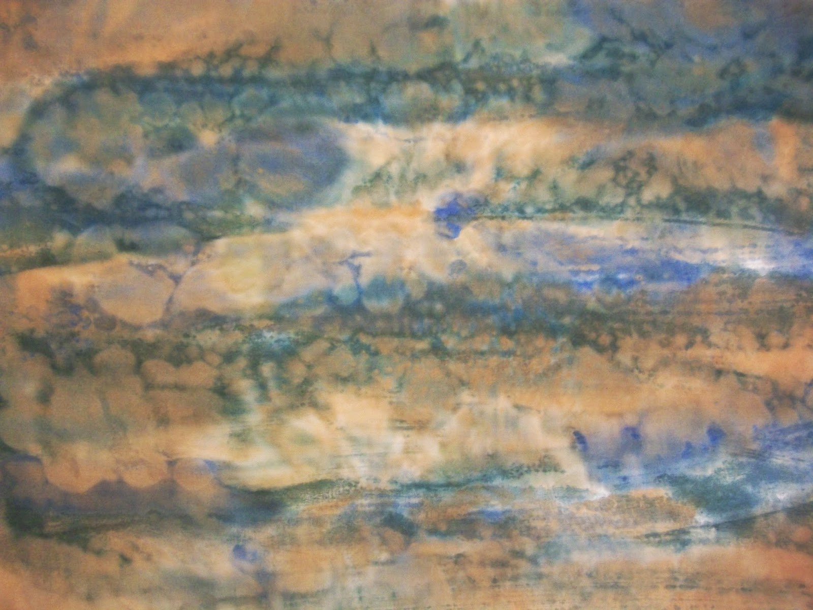 |
| Monoprinted background |
To get the look of cracked and distressed paint, I covered the monoprinted fabric with a layer of wheat flour paste resist. While it was still wet, I drew designs in the flour paste. When it dried completely, I crackled it.
 |
| Manipulating the dried resist to form cracks. |
Next I painted over the dried resist. The paint reached the fabric through the cracks and lines in the resist.
 |
| Painting over the dried resist. |
After setting the fabric and removing the resist, the next layer of paint was applied with brayer rubbings. I slipped a hot glue block and a piece of wire screening under the fabric and rolled over these textures with a paint-covered brayer.
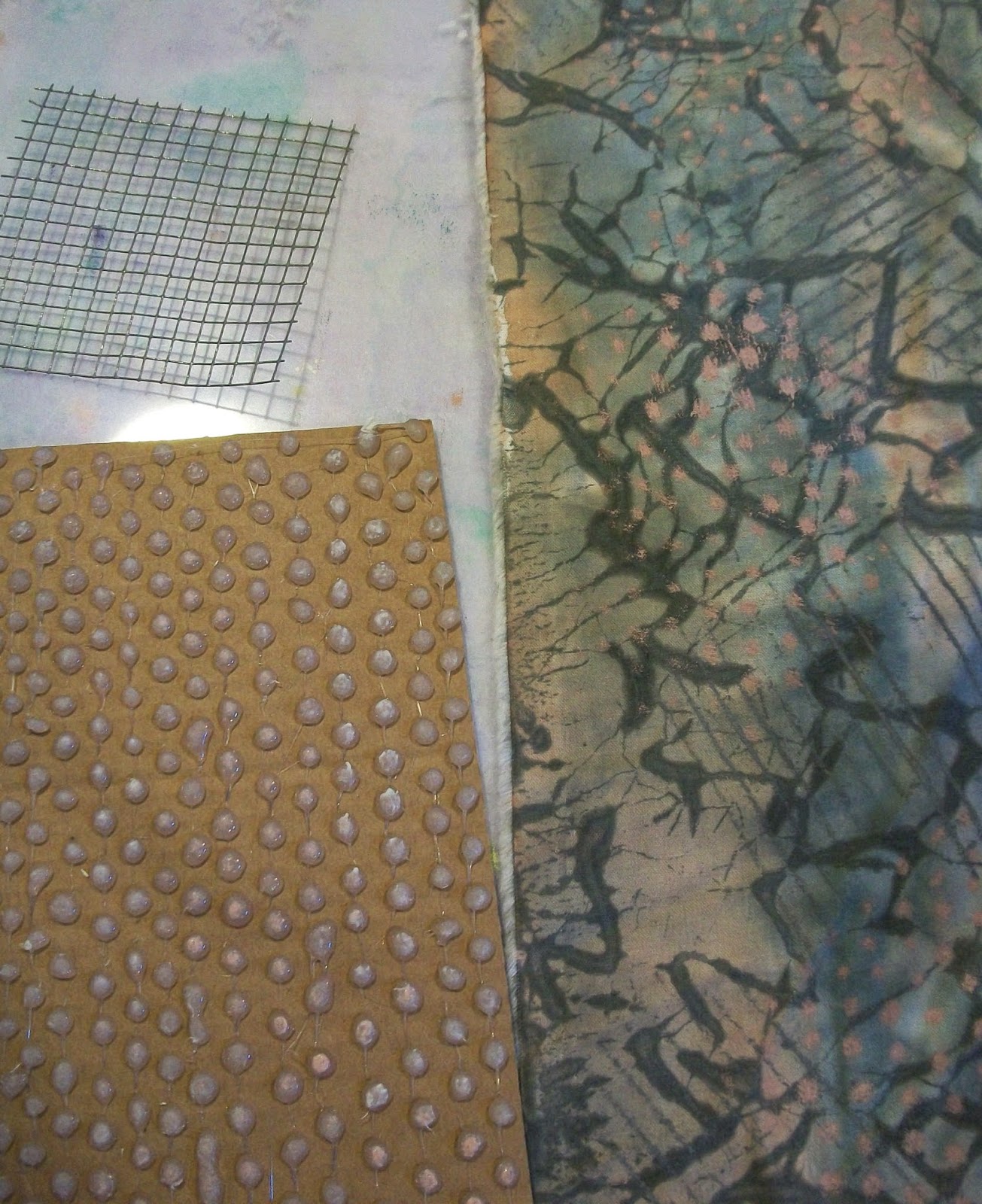 |
| Flat textures to slip under the fabric for brayer rubbings. |
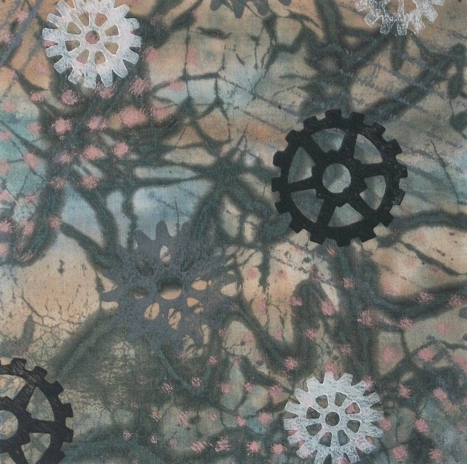
Finally, I carved gear designs in Speedball Speedy Carve blocks and printed over all the other layers.
 |
| Carved "gear" blocks. |
I'm quite happy with the result. Hope Susan and collection winner, Gabriele enjoy using this fabric.
 |
| Six inch fabric square that didn't make it into the collection below. But now done and off in the mail to the winner!! |

I really like your solution to the "industrial" theme, Julie! It's amazing what comes about when we are asked to create outside our usual comfort zone. Maybe a colorful version will be forthcoming?!
ReplyDeleteYou're right about "stretching" artistically, Lisa. There were moments when I was ready to quit on this. I think my perseverance paid off! Hmm...maybe bright colors next time...I'll have to see...
DeleteThis is just wonderful - the pattern and colors are so engaging, and though I tend toward bright colors as you do, the colors are lovely and soothing to the eye. Thanks for showing your process, layer by layer... this has inspired some printing ideas for me!
ReplyDeleteThanks, Sharmon. Maybe the "soothing" yet "engaging" aspect of it surprised me. I was ready to give up early in the process and wasn't planning to add so many layers but in the end it all seemed to work out. I remained "open" to the process and it seems that when I do that I usual have a satisfying result. So glad that you are inspired by some of the techniques. I don't know if you already get my monthly newsletter but if you don't, I cover lots of surface design techniques that you might have an interest in. (sign up in right-hand column)
DeleteMono printing over transparent film... man-o-man I need to try that! Your piece looks great and very industrial!
ReplyDeleteThanks, Carol. Here's a link to one of my newsletters that explains how to do the monoprinting: http://us5.campaign-archive1.com/?u=d8b51cbd7b9847f09709a5144&id=080514e9ad
DeleteIf you do try it, I'd love to see the results!